
Iconography
Icons are everywhere. A mere symbol but put it on the wrong spot and it creates a huge problem. Icons are tiny illustrations based on real world actions and objects that help in making decisions. It is a visual language that has been used even in the prehistoric times and has a massive impact to this day. We see icons(signs) everywhere- on roads, malls, cafes, books, airports, packaging, offices and pretty much any place you could think of. They also play a huge role in user experience of digital products.
I recently worked on creating an icon set thinking it wouldn’t be much of a challenge.. How hard could it really be to make a tiny drawing.God, was I wrong! There is so much that goes into creating these icons especially with so many new features being introduced in the digital world.
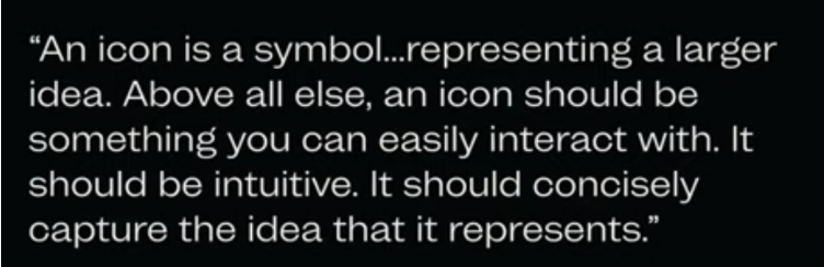
In the book ‘Dont Make Me Think’ (about usability), Steve Krug mentions the importance of conventions and user experience is enhanced when the user can make mindless choices. All these usability principles apply to iconography and here’s a few that are necessary to create a good icon set-
1. Recognizability It is important to maintain simplicity and clarity for all icons. With new upcoming features, it may not follow through as being familiar or conventional, but it is extremely important to relate it to real world objects that the user finds relatable and choose the right metaphors. In case of a complex icon that may not be recognizable quickly enough, it could cause ambiguity and increase cognitive load on the user giving the impression of difficulties throughout the experience.
2. Cohesion You would want every icon set to be presented as a whole and look like they belong to the same family. Icons should have a determined style and every added icon should comply with this style. The icon set should be consistent with the brand identity, making the design as a whole intuitive and familiar.
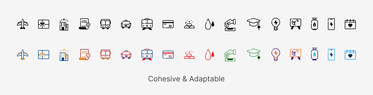
3. Balance and Composition Although most icons are composed of basic shapes and circles, there still needs to be a balance within an icon. The entire set needs to have a similar balance regarding corner roundness, stroke weight etc. One icon cannot be more heavy or lighter than the other. Having this balance makes it easy on the users eye and this can be achieved by making the icon design simple.
To achieve this , focus on-
Color When designing an icon, the color should go hand in hand with the brand and overall design of the product. The color style could be monotone, duotone, gradient fill, color blocked etc. However, its good to start with just a single neutral color like black.
Stroke or Fill This is the most primary choice made while designing an icon set that helps in maintaining consistency. Choosing which would be the best for a product could depend on factors like accessibility, user base, which market it serves to, adaptation etc. You could make a combination of stroke and fill, but it could create complications while maintaining cohesion. There’s alot of different icons that have elements like line breaks, hand-drawn style, curved corner but they are majorly a stylistic design decision made to align the design language.
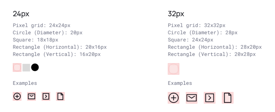
Size Size could make or break an icon set. To maintain size of icons, a grid is generally used in the size 24x24 or 32x32. The icon size should also be adjustable to make sure no accessibility issue occurs
Now that we have basic idea of what principles to keep in mind while creating an icon set. Lets outline a simple process that will help to get started with designing the icons.
Figure out the context Understand where you will be using these icons, what product is it, and how they will be used.
Brainstorm Create a list of all items that you need to create an icon of and brainstorm a few metaphors that can be used to represent the item. Make sure you dont limit yourself during this process, get everything out on paper even if it doesn’t seem like the best option. Look for keywords and synonyms to help come with compositions.
Research Icons might not seem like much but make sure to do some good research for your icons. Get inspiration from different styles of icons and how they are used in different contexts. Chances are that the icon you have in mind has already been well-designed. Analyze them to see if you can improve them.
Get Started Choose a style, layout your selected options for the icons and start vectorizing them. You can create multiple iterations and try to stylize these icons.
Test in UI Finally, when you have icons created, make sure to place them in the UI for testing to see if they are aligned with the design language and principes.
Conclusion
Icons could really change the direction of a product and help in maintaining brand identity. Custom icons can help your products stand out from the crowd. You can find different guidelines and rules on how to create an icon set. Following these rules will definitely help you create icons but dont be afraid to get creative. Experiment and test with different styles and metaphors, and have fun in the process.


